
Really
Rebranding a Straight Talking Queensland Estate Agency.
Client: Really Real Estate
Industry: Real Estate
Role: Creative Director
Brief: The company needed a rebrand after shifting from a 1% to a 2% commission model. The goal was to create a bold, transparent identity that stood out in an overpriced, impersonal industry while staying true to Queensland’s straightforward values.
The Approach
I led the creative direction alongside Joby Russell and the founders, exploring three brand positioning routes:
Mascot-Driven – A friendly Labrador as the brand face (“Your property’s best friend”).
Coastal Queensland – A high-end, beach-inspired aesthetic.
Bold, Retro, & Unmistakably Queensland – A strong, honest identity inspired by Australian football colours.
The third route was chosen, reflecting authenticity, transparency, and local values.
The Execution
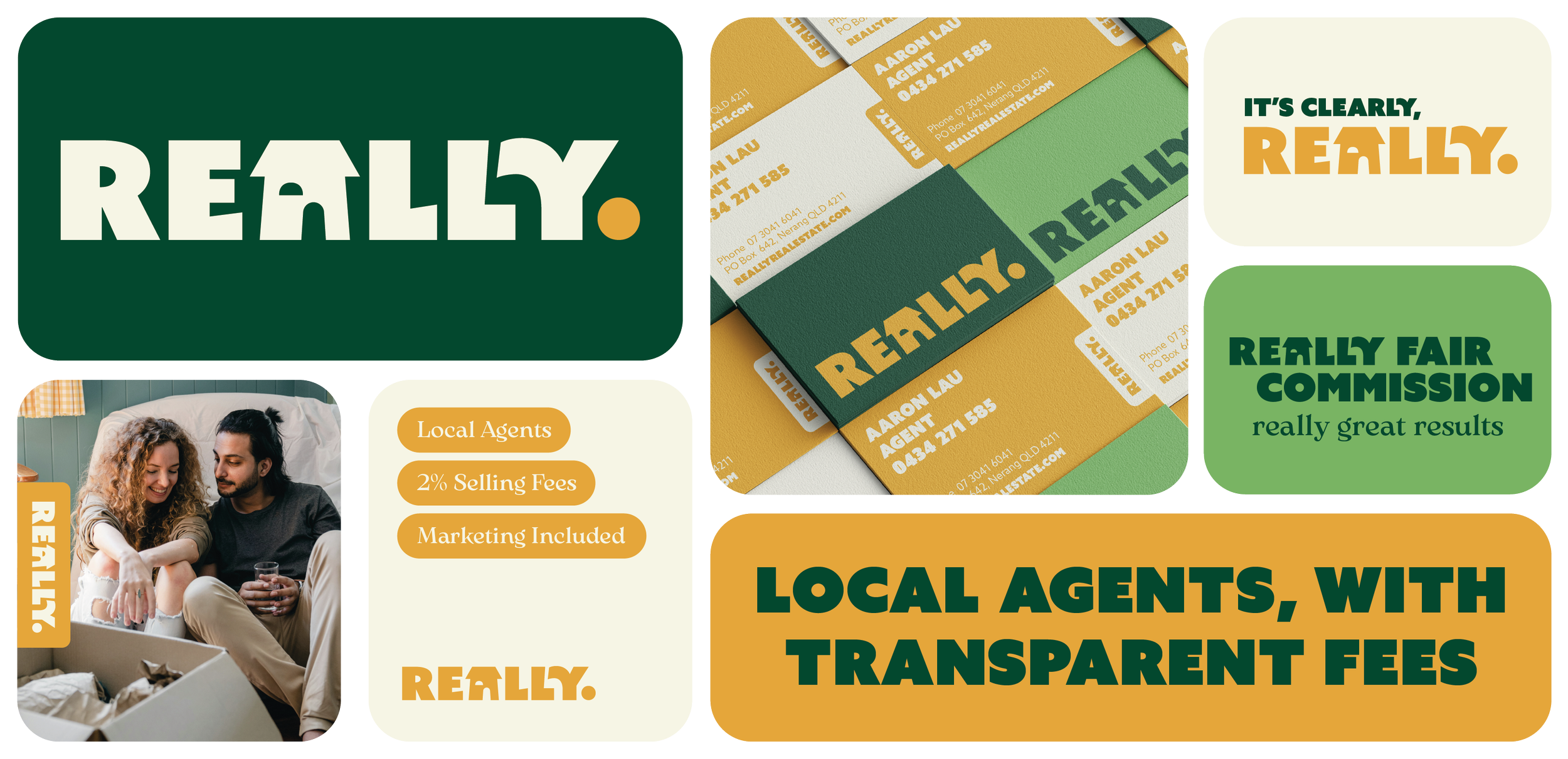
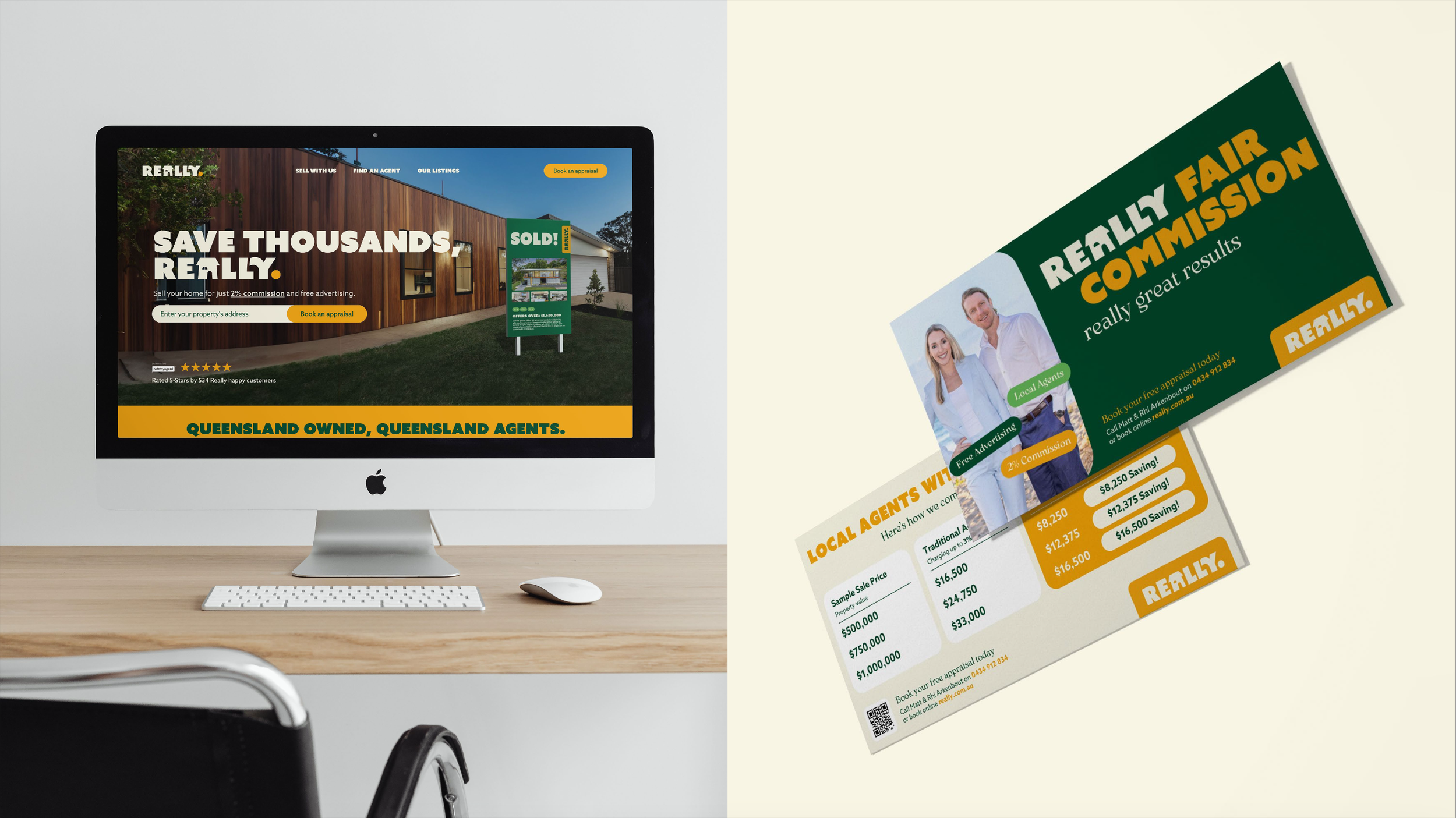
I developed the full brand identity and assets that positioned Really Real Estate as approachable yet professional. Including:
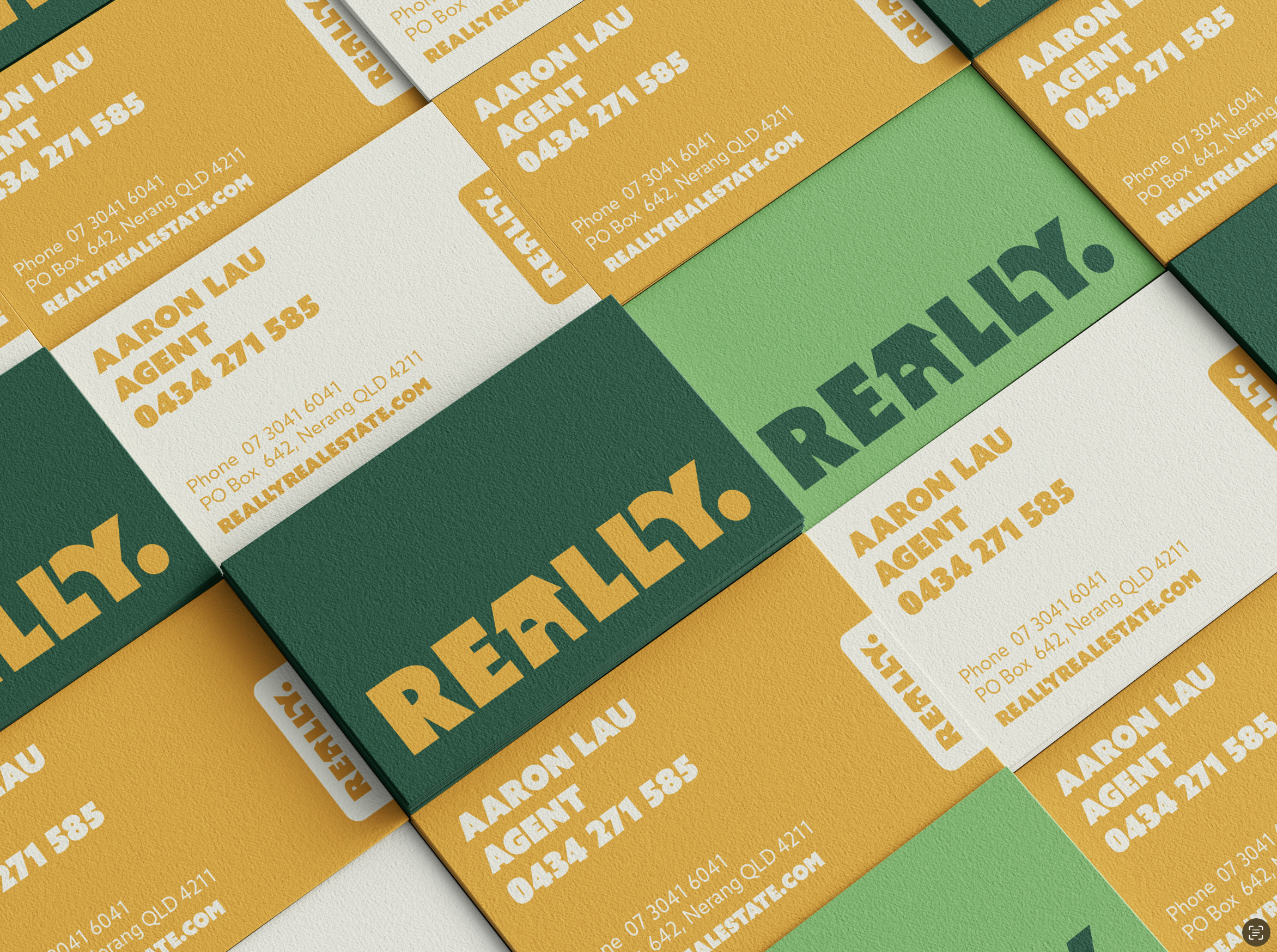
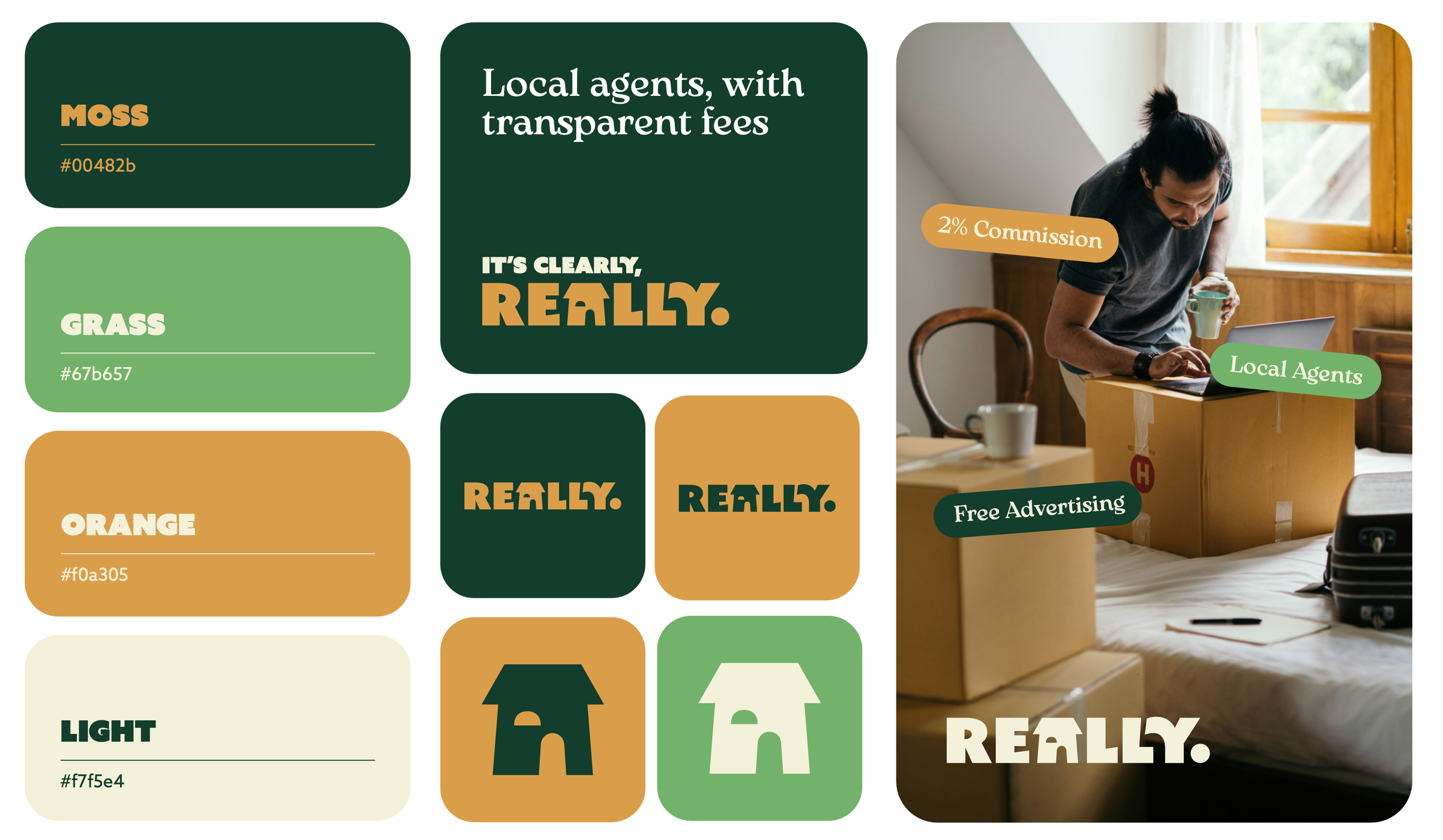
Logo & Identity – Emphasising clarity and reliability.
Brand Guidelines – Covering tone, colours, and typography.
Website UI/UX – A streamlined homepage concept.
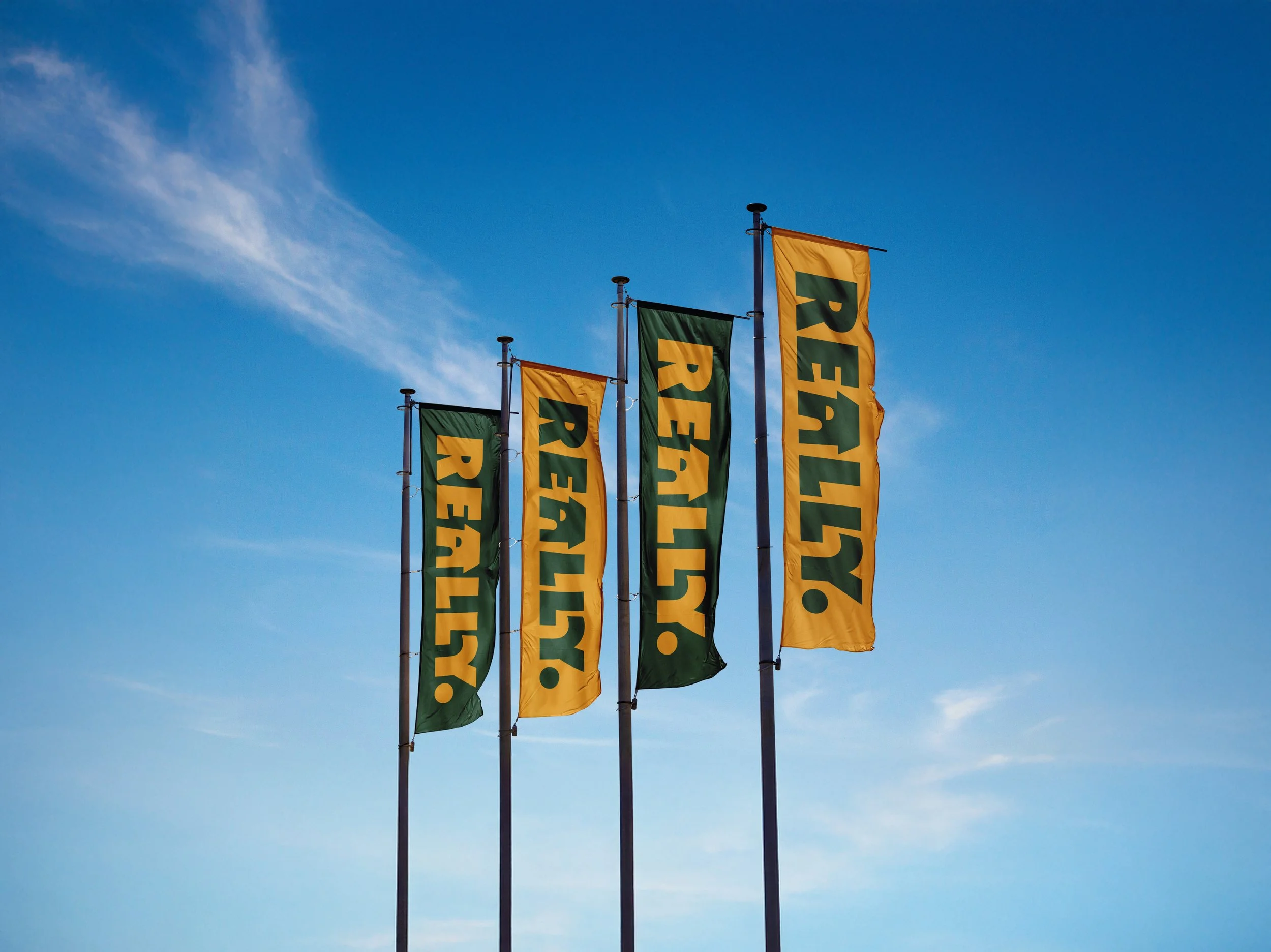
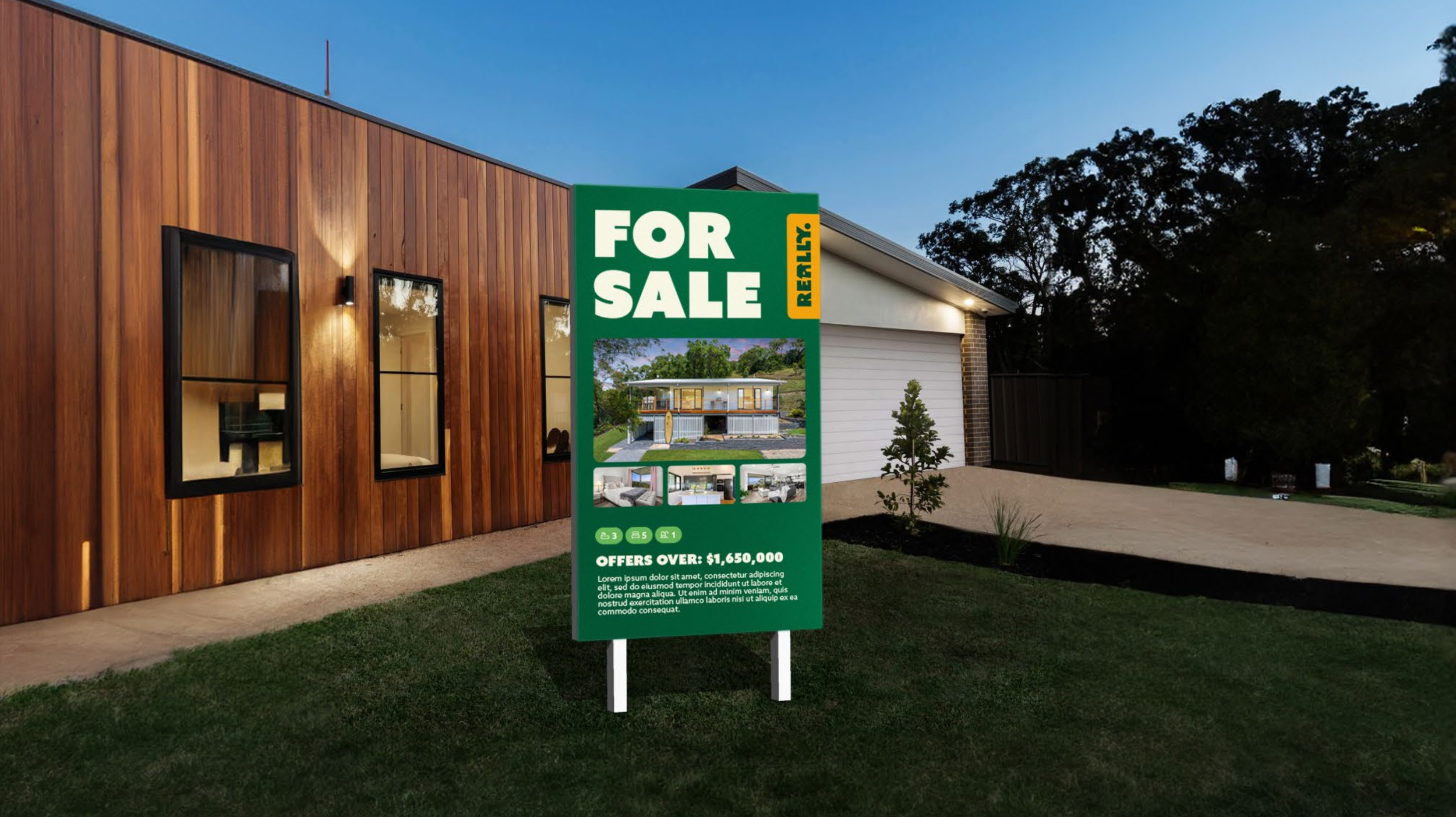
Marketing Collateral – Editable templates for brochures, signage, social media, and stationery, ensuring consistency and ease of use.
The Impact
The rebrand successfully repositioned the company, replacing a limiting name with one that embraced its straightforward, transparent, and down-to-earth identity. The new brand has already reinforced the company’s transition from a 1% to a 2% commission model without losing its value-driven appeal. It has helped Really Real Estate stand out in an otherwise generic market while providing the team with high-quality, flexible marketing materials to maintain brand consistency with ease.