
Amba
Building a Human centered Brand UI for the Future of Senior Care
Client: Amba
Industry: Brand & UX
Role: Creative Director
Brief: Amba is a tech-driven care solution for senior communities, using passive sensors to enhance caregiving. While functional, it lacked a cohesive brand and intuitive UI. My role was to refine the logo, develop a scalable identity, and redesign the interface for clarity and ease of use. The challenge was to balance innovation with empathy, ensuring Amba felt both cutting-edge and human-centered while remaining accessible to caregivers and care providers.
The Approach
Working with Amba’s leadership team, I developed a brand that positioned technology as an invisible shield, enhancing care without intrusion.
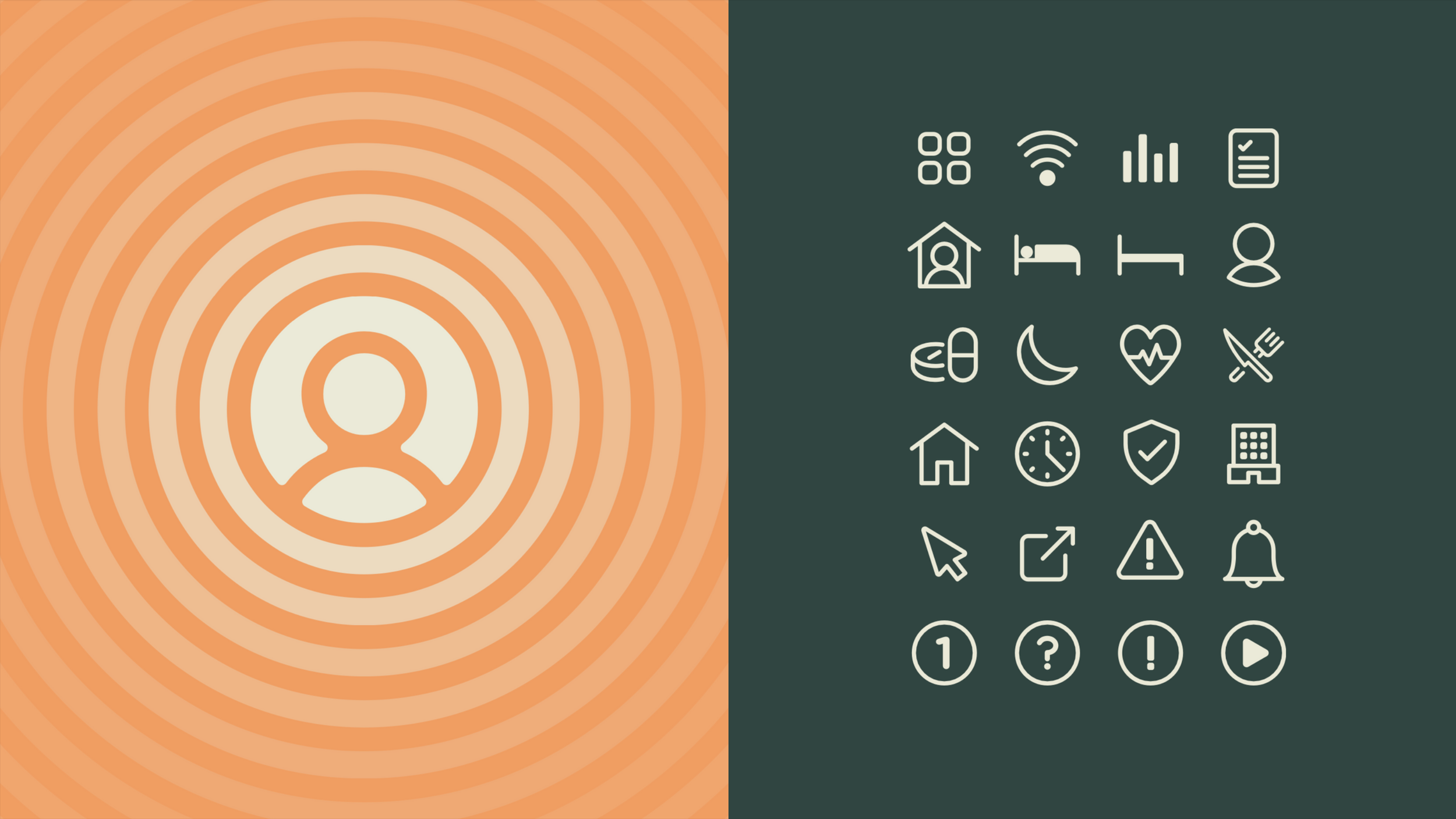
Logo Refinement: Strengthened the icon to symbolise protection, care, and passive monitoring. A pulsing animated version reinforced the real-time nature of Amba’s technology.
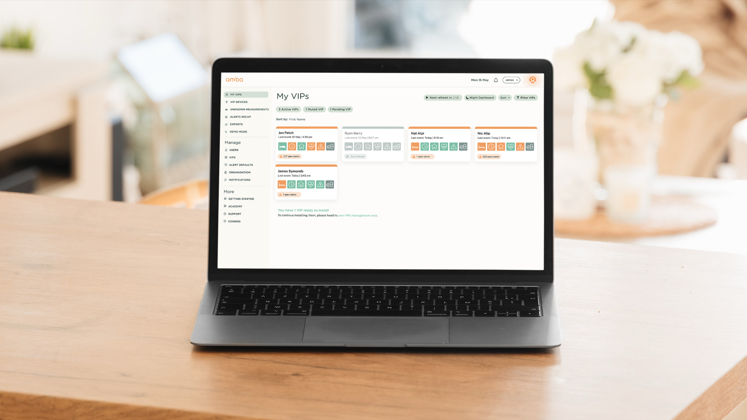
UI Overhaul: Simplified the interface with a colour-coded alert system (green = all good, amber = warning, red = urgent), custom icons for sensitive care issues, and a streamlined layout for quick, effortless navigation.
Brand Messaging: Established a clear, empathetic tone, focusing on supporting caregivers while maintaining seniors’ dignity and independence.
The Execution
Brand Identity: A refined, structured logo with a full guidelines document ensuring consistency across digital and print.
UI/UX Design: A redesigned dashboard with intuitive alerts, improved navigation, and seamless functionality.
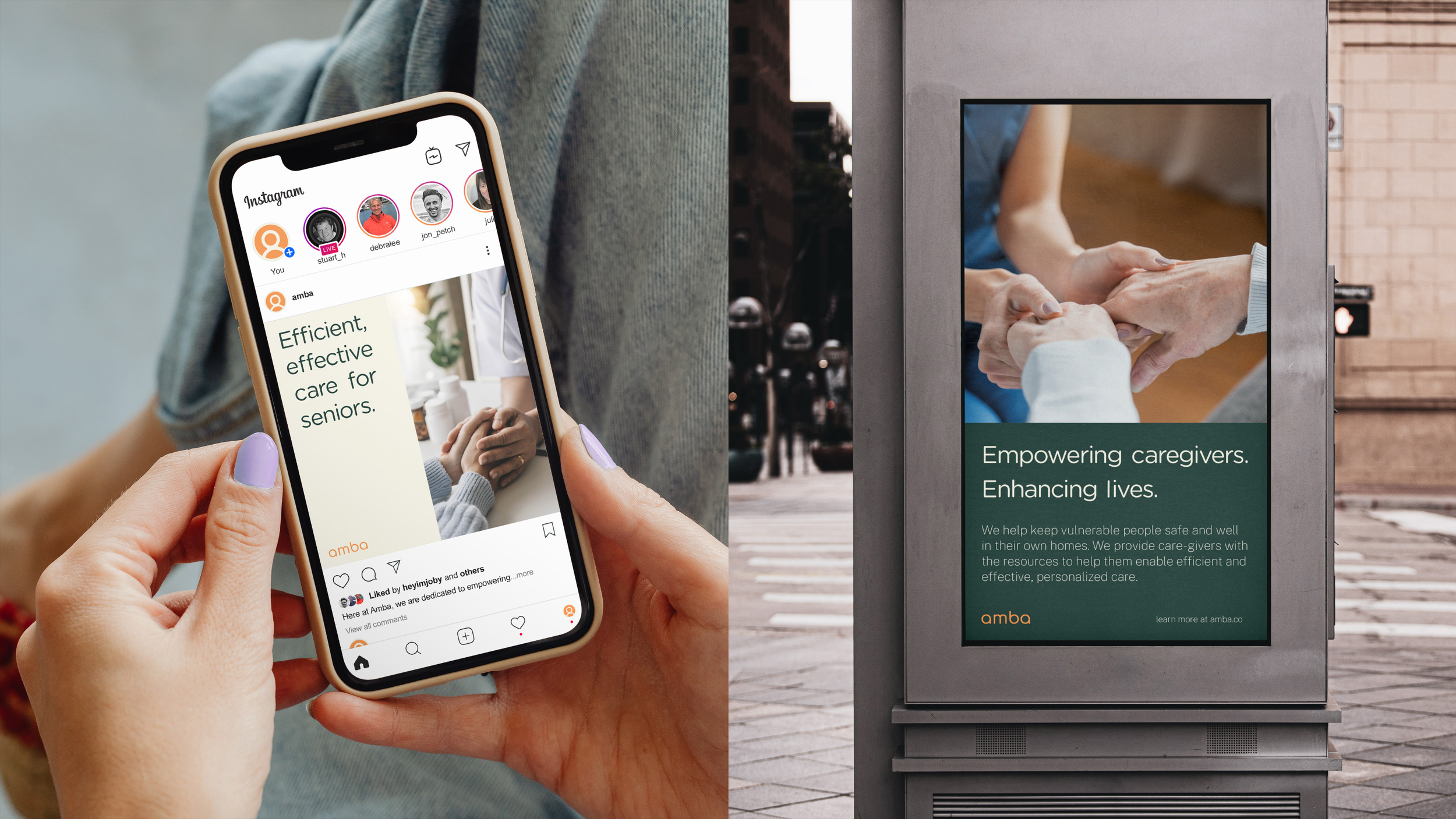
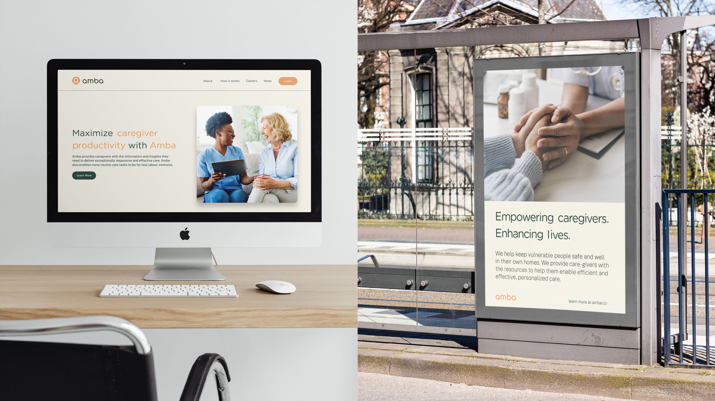
Marketing & Communication: A pitch deck for investors, explainer videos simplifying Amba’s offering, and clear brand messaging that resonated with care providers.
The Impact
Amba now has a fully realised brand system, positioning it as a trusted leader in tech-driven senior care.
The refined logo and intuitive UI make the platform more user-friendly, ensuring caregivers can act quickly and efficiently. With stronger messaging and a scalable framework, Amba is now primed for growth in new markets.